Six steps for planning clear communication
When you visit the Canada Aviation and Space Museum, I want you to connect with the content. As the museum’s Interpretive Planner, much of my work involves organizing ideas. I set up the framework for each exhibition: grouping objects, images, and facts in ways that make important connections clear. This way, you spend less time sorting things out — and more time exploring.
Every exhibition needs to be built on a strong foundation. The development team needs to be sure that all of their ideas fit neatly together before they can begin to create an experience. This can be said of many media — not just exhibitions. People naturally look for relationships and connections between facts, so whether you are planning a presentation or drafting a business plan, you need to organize your ideas carefully if you want to communicate them effectively. Taking a critical, intentional approach to content planning can take your communication to the next level.
Pulling meaning from a jumble of facts, ideas, and messages can feel daunting — especially on a tight deadline. Here are some techniques that I often use to sort through and simplify complex information.
1. Start by looking for general patterns
Write all of your facts, figures, and key themes on post-it notes, and move them around. Sort and re-sort them into different groups. What categories emerge? What is the relationship between these categories? How is this relationship significant? Often these answers can help you to focus in on your main point.

When we were planning the Life in Orbit exhibition in 2015, visitor testing showed that people wanted to learn more about how astronauts live in space — how they prepare food, sleep in tethered bags, and take care of, um, life’s personal necessities on the International Space Station (ISS). Our partners at the Canadian Space Agency understandably wanted to focus instead on the many fascinating research projects underway on the ISS, which is in essence a science lab in space. How did we bring things together? We made the central concept “living and working” in space — a two-part structure. The first half of the exhibition focussed on staying alive on the ISS, with a special emphasis on the many life-supporting systems that keep the ISS going. This set the stage for us to talk about the work that astronauts do in space, which includes important experiments as well as the maintenance of core systems on the ISS.
2. Look deeper for relationships and tensions
Look at the post-its in each of your groupings. Try placing them within a hierarchy, with general statements at the top and more specific ideas branching out underneath. Think about the connections and tensions that emerge. Do any of your ideas overlap? Do any contradict each other? Often these nuances can be helpful in getting to the core of what matters — and what will make your readers care about the topic.

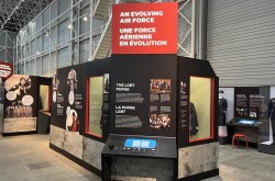
In our recent update of the museum’s First World War area, we questioned popular perceptions of life as a wartime pilot. Military aviation has often been presented as a prestigious pursuit. During the First World War, pilots were initially recruited from the upper social classes. The media of the time portrayed them as individualistic “knights of the air” who lived glamourous lives, far from the filth of the trenches. In reality, flight crews had low survival rates — at times less than three weeks. Airplanes at this time had open cockpits, exposing aircrew to extreme weather in all seasons, as well as a constant spray of castor oil in their faces. This tension between perception and reality created a memorable entry point for us to encourage visitors to think critically about the lived experiences of First World War aircrews.
3. Apply a familiar structure
As you group your ideas, see if you can apply familiar argument structures; this can help people to absorb your messages more easily. Can you structure some of your ideas as a point and counter-point? A cause and effect? A “then and now” statement or “either-or” dichotomy? Be cautious as you make these connections as they can sometimes lead to unintended assertions. In exhibitions, chronological structures can sometimes reinforce a myth of progress. It’s important to collaborate with your content expert and be sure that you don’t alter the meaning as you work to draw it out.
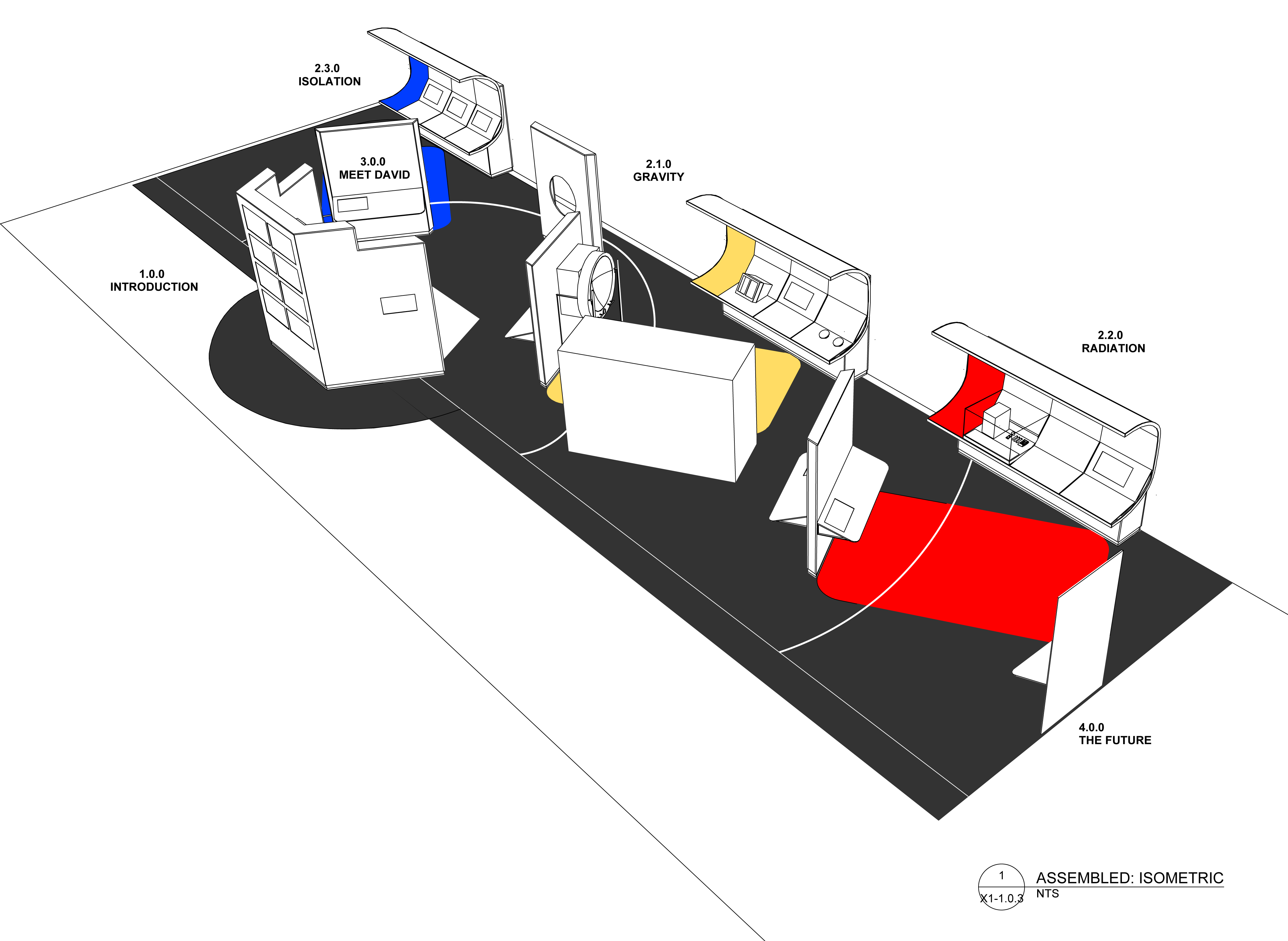
In the Health in Space exhibition, which opened in 2019, the team developed a three-part message structure. As we discussed the topics of health and medicine with a variety of experts — from a flight surgeon to a lead researcher — we noticed that everyone discussed the same three obstacles to ensuring astronauts’ health in space: overcoming variable gravity, exposure to elevated radiation, and living in an isolated environment. Gravity, radiation, and isolation became our three thematic sections.
4. Step back, visualize, and reduce
Once you’ve established a general structure for your points, set up an organizational chart. Look at your hierarchy of main points, general statements, and specific ideas. By and large, are they distributed evenly? If they aren’t, some of your messages may overwhelm your audience, while others may seem too shallow. Do all of the “boxes” at the same level represent the same weight of information and/or importance? Do you need to “bump” any ideas up or down? A strong message structure will have a simple organizational chart that’s easy to navigate, so keep it simple; Marie Kondo that content plan!
5. Look for through lines
Your document’s most important through line will be the thesis, main argument, or “big idea” in the case of an exhibition — but do any other themes or ideas recur across all of your groupings? Depending on the scope of your output, one or two additional through lines could become effective recurring call-outs or side-bars. You don’t want to highlight too many parallel ideas, of course, or your messaging will be too complicated to be memorable, but a catchy through line can evolve into an effective layer of call-outs or sidebars.

As we were planning the Health in Space exhibition, experts kept noting how specific challenges or innovations had real-world applications on Earth. Bone loss in low gravity can teach us about osteoporosis. Advances in radiation dosimetry can be applied to make life safer for people who work with radiation on Earth (like those treating cancer). This recurring thought became a series of “Back on Earth” sidebar points that help visitors connect to complex themes by answering the perpetual question, “So what?”
6. Think about your word choices
The planning phase is not too soon to think about wordsmithing. Finding and creating patterns in your word choices can help you to reinforce key ideas through repetition. Looking at your main points, or perhaps one of your sub-sections: can you find a phrase that communicates each distinct point when you substitute one key word? Wordsmithing can also help you to further simplify your message. Can you unify any of your terminology? Your verb tenses? While it may seem too rhetorical, this type of thinking can help you to tease out clearer connections within your content.
The next time you’re trying to pull a bunch of ideas together, I hope these strategies will be helpful. If you take the time to set a strong foundation, you will find that things fall into place more effectively as you begin to craft your final output. Remember that when people read or see your product, it will likely be the first time they encounter the information you’re sharing, and making the connections you suggest. A well-laid plan will not only set up the structure for your content, but help you to craft clear and creative text.







![A block of photographs showing some of the people involved in the bombing of beluga whales in the estuary and gulf of the St. Lawrence River. Anon., “La chasse aux marsouins [sic]. » Le Devoir, 15 August 1929, 6.](/sites/default/files/styles/thumbnail_7/public/2024-09/Le%20Devoir%2015%20aout%201929%20page%206.jpg?h=584f1d27&itok=TppdLItg)

