From four to one: The user-centric redesign of Ingenium’s websites

“Museums in a Digital World” certainly describes Ingenium’s trio of museums in Ottawa, which include the Canada Agriculture and Food Museum, the Canada Aviation and Space Museum, and the Canada Science and Technology Museum.
It also happened to be the overarching theme for the 46th annual Conference of the International Committee for Museums and Collections of Science and Technology (CIMUSET), hosted by Ingenium. This annual event facilitates the exchange of ideas as they relate to museums, professionals in the field, and cultural heritage. The theme for CIMUSET 2018 — Museums in a Digital World — dovetailed perfectly with one of my major projects as a User Experience Specialist for Ingenium: the migration and redesign of our museum websites.
Ingenium, its museums, and the rebrand
In 2017, the Canada Science and Technology Museums Corporation rebranded as Ingenium — Canada's Museums of Science and Innovation. Ingenium and its three museums celebrate creativity, discovery, and human ingenuity, focusing on the stories of people. With this user-centric shift came the need to consolidate four separate websites under one banner, while preserving each museum’s unique identity. Working within a tight timeline, our aim was to restructure existing content to increase visitor experience and create stronger cross-promotional opportunities, all while emphasizing accessible and inclusive design.
With this user-centric shift came the need to consolidate four separate websites under one banner, while preserving each museum’s unique identity.
The rebranding of Ingenium did not affect the way we structured ourselves. We were, and still are, a corporation with three distinct museums. The Canada Agriculture and Food Museum teaches about food and animals on its working farm and heritage site; the Canada Aviation and Space Museum — located on a former military base — informs its audiences about aviation and aerospace technology, and contains the most extensive aviation collection in Canada; and the Canada Science and Technology Museum — which re-opened in November 2017 — features artifacts and interactives around the theme of science, technology, and innovation in Canada.
Our former websites (corporate and three museums) used the same template across all four to indicate this interconnection to the public, using colour, text, and content as a primary means of distinguishing between them. The corporate site was black, the Canada Agriculture and Food Museum’s site was green, the Canada Aviation and Space Museum’s site was blue, and the Canada Science and Technology Museum’s site was red. All four colours which could be found in the corporate logo. However, despite these efforts, the public, even locals, did not realize we were all connected. The rebranding became not only about a change of name, but about shifting the way we thought about ourselves, internally, and how we projected that, externally, to the public. Ingenium is about celebrating creativity, discovery, and human ingenuity, focusing on the stories of people and we had to ensure that this was reflected in the redesign of our websites.

Screenshots (not to scale) of former Ingenium websites showing identical template.
From left to right: the websites of Ingenium’s corporation, the Canada Agriculture and Food Museum, the Canada Aviation and Space Museum, and the Canada Science and Technology Museum.
Project objectives
Our four major objectives for this project were to design a website that was:
- User-centric. Just as the new branding was about placing a focus on the stories of Canadians, we wanted our website to reflect that we were designing with the visitor in mind. That meant ensuring it was visually stunning with a minimalist approach, while being accessible and inclusive. This required employing user experience (UX) methodologies to the research, design, and implementation process.
- Mobile-friendly. While we wanted to ensure that our new website was functional on all browsers and responsive across mobile, tablet, and desktop devices, we designed mobile-first, as our analytics indicated that a growing number of our visitors were accessing our former websites on their cellphones.
- On a common platform. We decided to use Drupal 8 as our platform as it is easy to maintain, open source, and has a strong community of developers that we could access, when needed. It also allows a component to be easily re-used throughout the site —ensuring a cohesive look and feel across the webpages. Finally, Drupal 8’s easy-to-learn interface gives us the opportunity to empower our staff to upload their own content, rather than relying solely on our two developers.
- A migration, NOT a rebuild. This was one of the most important and challenging objectives. Due to our tight timeline and budgets, we would not be rewriting or restructuring content, but rather migrating the content from the former websites in an agile and phased approach. As we progressed through the project, however, this proved impossible in some instances.
Research and design
The website redesign was a two-year, agile project beginning in 2016, and projected to the end of 2018 (although it is still ongoing due to our need to restructure some content). The work was divided into three phases: the first to build the Ingenium Channel (on which you’re currently reading this article), followed by the integration of corporate information (now found in the footer of the website), and finally, the full integration of the museum websites onto the new platform.
Due to our agile approach for the website project, research was done in bulk early in each phase, but continued throughout the project. Some of this initial research included conducting environmental scans of existing websites with similar museum structures, researching strong design strategies, developing personas and journey maps, and developing wireframes and creatives.

Early stages of planning the needs and wants for our personas on the Channel website.
The existing content on our websites also needed to be thoroughly analyzed. A large portion of the existing content was being migrated over to the new platform, but some of it was purposely discarded, so a content inventory was essential. In addition, we hired a company to do a thorough evaluation of the user behaviour for our three museums. This information helped inform how we should be structuring the website, creating an information architecture that was user-centric and easy to understand.
Next steps
The Ingenium website redesign is currently in its final phase of completion. While migration was a major objective of the project, the progress had to halt to invest time in staff consultation sessions and in-depth user research for the restructuring of its Educational Programs.
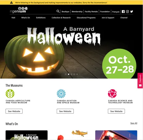
User testing is being conducted on the current redesign of many of the sections, and the results of this will determine if more work is needed to achieve a user-friendly website. At the same time, online tools like Hotjar have been implemented to obtain data on how users are engaging with the website, and visitors can provide written feedback using a button on the side of the page. A message bar at the top of our website informs the public that our site is under construction, to maintain open communication and hopefully alleviate some frustrations. The website will continue to update and evolve including adding stronger visuals, and providing staff with training on Drupal 8 so that they feel comfortable uploading their own content.


